
燕 雀 相 賀 Dedicated Page 「えんじゃくそうが」 Idioms and japanese Kanji
| idiom | reading |
| 燕 雀 相 賀 | |
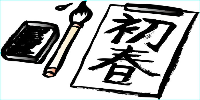
This page introduces multiple examples of four-character idioms and four-letter words displayed in various designs, focusing on their presentation.
We have created and published images of beautifully expressed idioms that serve as examples for calligraphy and shodo (Japanese calligraphy).
In Japan, this serves as a model for calligraphy assignments during summer vacation at school. Additionally, it can be a reference for keyword searches related to the New Year's calligraphy tradition during the winter break.
We also introduce Gothic-style Japanese characters that are used in posters and other materials.
燕 雀 相 賀 how to write. Japanese idioms and calligraphy
| Cool Idiom 燕 雀 相 賀 Overview |
We express four-character idioms in various designs, such as Mincho, Gyosho, Gothic, and Sosho styles. These can serve as general examples for lettering in Japanese, posters (handmade signs), and calligraphy assignments like the New Year's calligraphy tradition.
 |
 |
 |
 |
 |
 |
 |
 |
We have compiled a page featuring design samples focused on a single four-character idiom.
In cases of old kanji or special characters (Unicode), there may be instances where the kanji is missing.
Mincho Font 「燕 雀 相 賀」
| About Mincho Font |
Mincho is a traditional Japanese font that is widely used in printed materials, books, and newspapers. Its characteristics include a contrast between long vertical strokes and shorter horizontal strokes, which enhances readability and makes it appealing.
Originating from the Edo period, Mincho is a serif typeface, which gives the characters sharp edges and a refined impression.
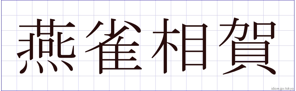 |
| 燕 雀 相 賀 | |
| えんじゃくそうが ennjakusouga | |
| ennjakusouga-1.jpg |
| About Usage Forms |
It is primarily suitable for formal documents and academic texts, conveying a sense of reliability and prestige, which is why it is often used in business documents. While it is widely adopted in digital media due to its readability, caution is needed as readability decreases at smaller sizes. Mincho is utilized by many designers as a font with classic appeal.
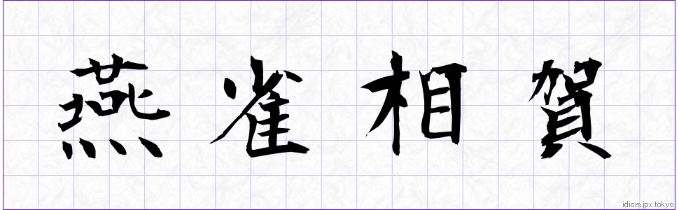
Textbook Font 「燕 雀 相 賀」
| About Textbook Style |
Textbook type is a font primarily used in educational settings, especially optimized for textbooks and learning materials. Its characteristics combine the strengths of both Mincho (serif) and Gothic (sans-serif) typefaces, offering high legibility with clear, distinct characters. The design features simple letter forms with uniform strokes.
It could also serve as a reference for how to hold the brush when doing calligraphy.
 |
| 燕 雀 相 賀 | |
| えんじゃくそうが ennjakusouga | |
| ennjakusouga-2.jpg |
| About Usage Forms |
The textbook typeface is designed for learning and educational settings, with a particular emphasis on legibility for beginners. As a result, kanji, hiragana, and katakana are arranged in a balanced way to enhance readability.
The typical uses include textbooks, workbooks, and reference books, serving to aid comprehension in educational settings. The textbook typeface is an important font that provides both ease of learning and visual stability.
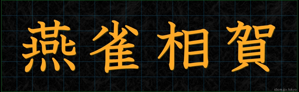
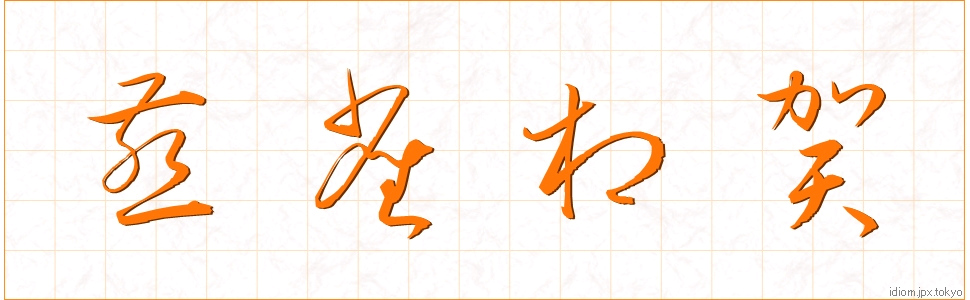
semi-cursive style 「燕 雀 相 賀」
| Regarding the semi-cursive style. |
The brush calligraphy font is based on Japan's traditional calligraphy, expressing the movement and strength of the brush. Its characteristics include clear variations in stroke thickness and pressure, as well as flowing curves and unique shapes. As a result, the characters acquire a sense of motion and emotion, creating an artistic impression.
It could also serve as a reference for how to move the brush when practicing calligraphy.
 |
| 燕 雀 相 賀 | |
| えんじゃくそうが ennjakusouga | |
| ennjakusouga-3.jpg |
| About Usage Forms |
The typeface is intended for formal and special occasions, such as celebratory invitations, thank-you letters, and hanging scrolls.
The brush calligraphy typeface emphasizes the warmth and individuality of handwriting, creating a friendly and approachable feel. However, since its legibility can sometimes be reduced, careful consideration of the size and arrangement of the characters is necessary when using it.
The brush calligraphy typeface, which blends tradition and beauty, is utilized in many different contexts as an attractive font.
Gothic typeface 「燕 雀 相 賀」
| About the Gothic Typeface |
The Gothic typeface is a sans-serif font characterized by a simple and modern appearance. In Japan, it is widely used, particularly in contrast to the Mincho style.
The letter forms are uniform, and the stroke weight is consistent, which results in high legibility. This makes the Gothic typeface especially valuable in digital media, advertising, and posters.
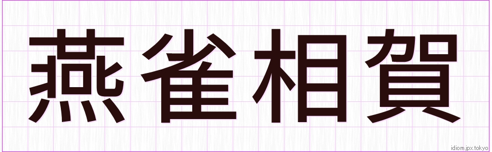 |
| 燕 雀 相 賀 | |
| えんじゃくそうが ennjakusouga | |
| ennjakusouga-4.jpg |
| About Usage Forms |
Because Gothic typefaces can accommodate a wide range of designs—from casual to formal—they are suitable for business documents, websites, and presentation materials. They are particularly effective when you need to convey information quickly.
In recent years, it has become popular as a design trend, with a variety of styles being developed. It demonstrates its appeal in situations where simplicity and clarity are essential.
Maru Gothic 「燕 雀 相 賀」
| About Maru Gothic |
One characteristic of Maru Gothic is that the beginning and ending parts of the characters are rounded.
Since it has a rounded silhouette, it is expected to have a soothing effect on psychological stimuli. Therefore, choosing Maru Gothic based on the content or purpose being communicated can be very effective.
Because the character shapes are uniform and the stroke widths are consistent, they offer high legibility and are particularly valued in digital media, advertisements, and posters.
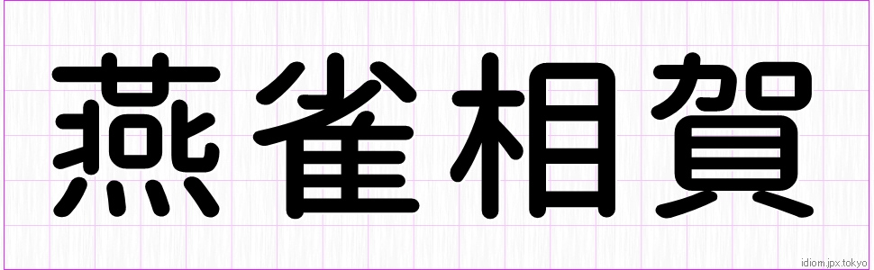 |
| 燕 雀 相 賀 | |
| えんじゃくそうが ennjakusouga | |
| ennjakusouga-5.jpg |
Genkai Mintyo 「燕 雀 相 賀」
| About Genkai Mincho Typefaces |
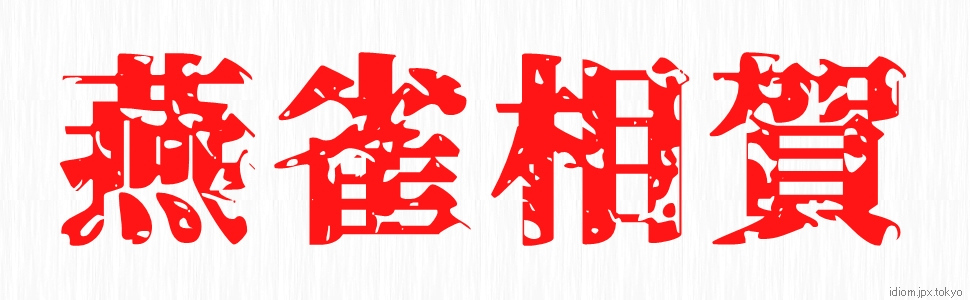
These characters are based on a Mincho font and feature a pattern texture that gives the impression of having undergone a subtraction-style processing.
Because the fine details of the characters have been trimmed, they have an impression of being weathered or abraded.
By configuring the overall color settings—such as the "text color," "text outline color," and background color—you can create fonts that exude a spooky impression. This approach allows for impactful expressions in videos, posters, and other visual media.
 |
| 燕 雀 相 賀 | |
| えんじゃくそうが ennjakusouga | |
| ennjakusouga-6.jpg |
| About Usage Forms |
Genkai Mincho can be expressed in a striking, illustrative style. In recent years, it is also frequently seen as the thumbnail image for video introductions.
Using Genkai Mincho as a font for text text text is difficult because the characters are small, making it difficult to see the Genkai Mincho's unique design.
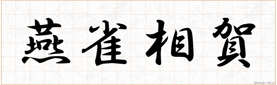
example of penmanship 「燕 雀 相 賀」
| About Brush Typefaces |
Brush typefaces are fonts based on traditional Japanese calligraphy, expressing the movement and power of the brushstrokes. Characteristically, the thickness of the brush strokes and the variation in pressure are clear, and the flowing curves and unique shapes are appealing. This gives the letters an artistic impression, imbued with movement and emotion.
 |
| 燕 雀 相 賀 | |
| えんじゃくそうが ennjakusouga | |
| ennjakusouga-7.jpg |
| About Usage Forms |
The most common occasions for use are formal and special occasions such as celebratory invitations, thank-you notes, hanging scrolls, etc.
Brush typefaces emphasize the warmth and character of handwritten text, creating a sense of friendliness. However, they can be less readable, so care must be taken in the size and placement of letters when using them. Brush typefaces are used in many situations as an attractive font that combines tradition and beauty.
cursive script 「燕 雀 相 賀」
| About Cursive Writing |
Cursive fonts are based on traditional Japanese calligraphy and express the movement and power of the brushstroke. Characteristically, it has clear variations in brush thickness and pressure, and its flowing curves and unique shape are appealing. This gives the letters an artistic impression, imbued with movement and emotion.
 |
| 燕 雀 相 賀 | |
| えんじゃくそうが ennjakusouga | |
| ennjakusouga-8.jpg |
| About Usage Forms |
The most common occasions for use are formal and special occasions such as celebratory invitations, thank-you notes, hanging scrolls, etc.
Brush typefaces emphasize the warmth and character of handwritten text, creating a sense of friendliness. However, they can be less readable, so care must be taken in the size and placement of letters when using them. Brush typefaces are used in many situations as an attractive font that combines tradition and beauty.


Significance of Font Design
They play an important role in the communication and visual presentation of information. First, fonts can greatly affect the impression of a message depending on the shape and style of the letters. For example, serif fonts give a traditional, formal impression, while sans-serif fonts create a modern, clean look.
They also contribute to readability and legibility and are designed to aid visual attraction and understanding, especially in advertising and publications. In addition, fonts can serve as part of a brand identity, a means of expressing the personality of a company or product.
This homepage introduces how to write various four-character phrases.
Some kanji characters may be garbled because they are not supported in the font-based character design. We have also taken care to ensure that there are no mistakes in the kanji and reading notations, but there may be kanji mistakes or conversion errors.
The introduction of typefaces is only shown as an example as a sample of typeface design. Even similar fonts may differ in minor details. It is not intended to indicate superiority or inferiority of any typeface.
The font and cursive typefaces shown on this page are not necessarily correct, as they often reflect the individuality of the person actually writing them.